library(tidyverse) #general use
library(DT) #package for making interactive tables
library(plotly) #package for making interactive figures

screentime <- read_csv("screentime.csv")What Factors Influence My Daily Screen Time?
R
ggplot2
Affective Visualization
Tracking my screen time over one month and using both ggplot visualizations and an affective visualization to explore patterns in my habits
Overview
Timeline: January–February 2026
Course: ENV S 193DS - Statistics for Environmental Science
Methods: Daily data collection, exploratory visualization, affective visualization, trend analysis
This project explored how my daily screen time changes depending on different parts of my routine during the school quarter. I collected data from January to February on my daily screen time, along with other factors such as class and study time, sleep, commuting time, social plans, and whether I had an exam or project due.
The goal of this project was both analytical and personal. I wanted to better understand my own habits, identify patterns that might explain why my screen time changes from day to day, and think about how data can be represented in a way that feels more reflective and human. To do this, I combined standard plots made in R with ggplot2 and a hand-drawn affective visualization inspired by Giorgia Lupi and Stefanie Posavec’s Week of Goodbyes.
Tools and Skills
- R
- ggplot2
- Exploratory Data Analysis
- Personal Data Collection
- Affective Visualization
- Visual Encoding
- Data Interpretation
- Reflective Design
Project Goals
This project focused on a few main questions:
- How does my screen time vary across different days of the week?
- Is there a relationship between class/study time and screen time?
- How do other contextual factors, such as sleep, social plans, commuting, or deadlines, shape my daily screen use?
- How can personal data be visualized in a way that captures both patterns and lived experience?
Methods
This project combined quantitative data analysis with more interpretive visual design.
Data Collection
I recorded daily observations on my screen time, measured in hours, along with several explanatory variables related to my routine. These included:
- Class + study time (hours)
- Day of the week
- Sleep hours from the night before
- Time spent commuting
- Whether I had social plans
- Whether I had an exam or project due
Because the data was collected over a specific academic quarter, the results are shaped by my schedule during that time. Even so, the project still helped reveal broader patterns in how my responsibilities and habits interact.
# Using package DT to create an interactive table
datatable(data = screentime)
Code-Based Visualizations
Visualization 1: Screen Time Across Days of the Week
This visualization shows how my daily screen time varies across different days of the week. Each point represents one day, allowing variation in screen time to be compared across weekdays and weekends.
I used jittered points so that observations on the same day would not overlap, and assigned a different color to each day of the week to make patterns easier to compare visually.
The code also extracts the most recent observation date from the dataset and displays it in the subtitle so the time frame of the data is clear.
#finding most recent observation date
most_recent_date <- max(screentime$Date)

plot1_static <- ggplot(data = screentime, #starting with my dataframe
       aes(x = `Day of Week`, #x-axis: categorical variable
           y = `Screen Time (hours)`, #y-axis: response variable
           color = `Day of Week`, #coloring by day of week
           text = paste("Date:", Date, #for interactive plot points
                        "<br>Day:", `Day of Week`,
                        "<br>Screen Time:", `Screen Time (hours)`, "hours"))) +
  geom_jitter(width = 0.15, #adding horizontal jitter
              alpha = 0.7, #making points slightly transparent
              size = 2) + #point size
  labs(
    x = "Day of Week",
    y = "Screen Time (hours)", #changing axes labels
    title = "Screen time by day of the week", #title summarizing main message,
    #subtitle for most recent observation
    subtitle = paste("Most recent observation:", most_recent_date)
  ) +
  scale_color_manual( #changing colors from default
    values = c("Monday" = "firebrick",
               "Tuesday" = "darkorange",
               "Wednesday" = "yellow3",
               "Thursday" = "green3",
               "Friday" = "blue4",
               "Saturday" = "slateblue4",
               "Sunday" = "pink3")
  ) +
  theme_light() + #changing theme from default
  theme(legend.position = "none") #removing legend

# convert to interactive plotly
plot1_interactive <- ggplotly(plot1_static, tooltip = "text") |>
  layout(
    font = list(family = "Sans"),  #editing font for figure title and axes
    hoverlabel = list(
      font = list(
        family = "Sans", #hover text font
        size = 13, #hover text font size
        color = "#FFFFFF" #font color for hover text
      )
    )
  )

#display interactive version of the plot
plot1_interactive
Figure 1. Screen time (hours) across days of the week. Each point represents one daily observation, showing variation in screen use depending on the day. Screen time appears somewhat higher and more variable on weekends compared to some weekdays, suggesting that daily schedule may influence overall screen use.
Visualization 2: Screen Time vs. Class/Study Time
This visualization examines the relationship between class/study time and screen time using a scatterplot. Each point represents one day, allowing the two variables to be compared directly.
A linear trend line is added to summarize the overall relationship between the variables. This helps identify whether days with more academic work tend to correspond to higher or lower screen time.
plot2_static <- ggplot(
  data = screentime, #starting with my dataframe
  aes(
    x = `Class + Study time (hours)`, #x-axis: continuous predictor
    y = `Screen Time (hours)`, #y-axis: response variable
    #custom hover text for the interactive plot
    text = paste(
      "Date:", Date,
      "<br>Class + Study Time:", `Class + Study time (hours)`, "hours",
      "<br>Screen Time:", `Screen Time (hours)`, "hours"
    )
  )
) +
  geom_point(
    color = "darkorange", #changing color from default
    size = 2, #point size
    alpha = 0.8 #making points slightly transparent
  ) +
  #adding linear regression trend line to show overall relationship
  geom_smooth(
    method = "lm",
    se = TRUE, #showing confidence interval around regression line
    color = "#014f86", #custom color for trend line
    inherit.aes = FALSE, #preventing hover text from applying to regression line
    aes(
      x = `Class + Study time (hours)`,
      y = `Screen Time (hours)`
    )
  ) +
  labs(
    x = "Class + Study Time (hours)", #changing axes labels
    y = "Screen Time (hours)",
    title = "Relationship between class/study time and screen time", #title summarizing main message
    #subtitle showing most recent observation date
    subtitle = paste("Most recent observation:", most_recent_date)
  ) +
  theme_light() #changing theme from default


#using plotly package to make the figure interactive
plot2_interactive <- ggplotly(plot2_static, tooltip = "text") |>
  layout(
    font = list(family = "Sans"), #editing font for figure title and axes
    hoverlabel = list(
      font = list(
        family = "Sans",
        size = 13, #font size for hover text
        color = "#FFFFFF" #font color for hover text
      )
    )
  )

#display interactive version of the plot
plot2_interactive
Figure 2. Relationship between class/study time (hours) and screen time (hours). Each point represents one day, with the line showing the overall linear trend. The slight negative trend suggests that on days with more class and/or study time, screen time tends to be slightly lower, although the relationship does not appear very strong.
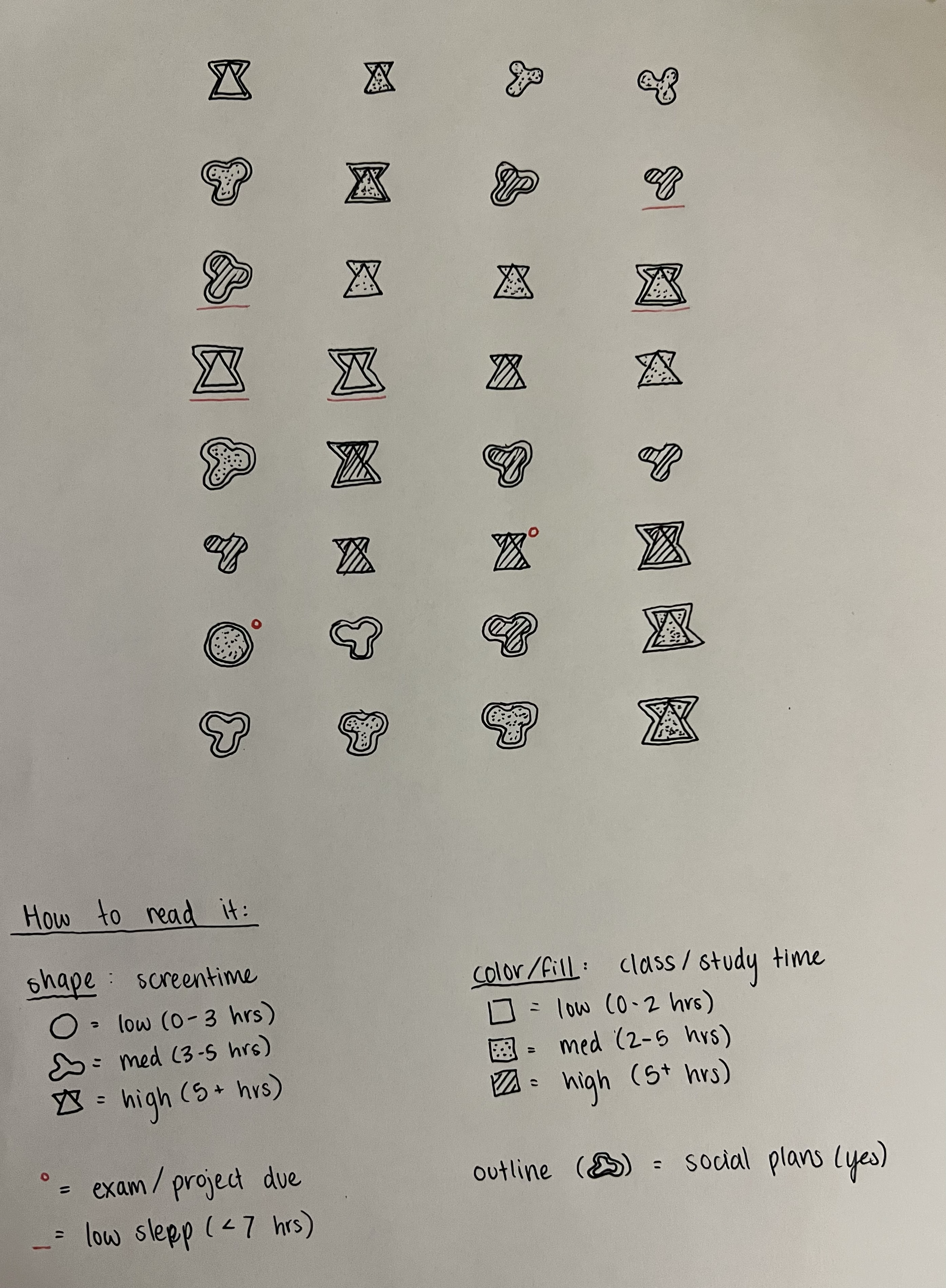
Affective Visualization
Alongside the code-based plots, I created a hand-drawn affective visualization to represent the same dataset in a more symbolic and personal way. The project was inspired by Giorgia Lupi and Stefanie Posavec’s Week of Goodbyes, which uses hand-drawn marks to encode personal experiences. Rather than focusing only on statistical relationships, this piece emphasizes how daily habits feel when viewed together over time.
The visualization uses a custom visual language:
- Shape represents screen time level
- Fill pattern represents class/study time
- Outline style indicates social plans
- Red underline marks low sleep
- Red dot marks an exam or project due
This format allowed me to visualize my habits in a way that feels more reflective than a conventional chart, while still encoding several variables at once.
Key Takeaways
Several patterns emerged from this project:
- Screen time varies across days of the week, with some weekend days showing more variability.
- There appears to be a slight negative relationship between class/study time and screen time.
- Contextual factors such as sleep, deadlines, and social plans likely shape screen time in ways that are not fully captured by a simple regression line.
- Affective visualization can reveal patterns and experiences that traditional charts may not communicate as clearly.
Reflection
This project helped me think about data in two different ways: as something to analyze statistically, and as something to represent personally. The ggplot visualizations helped identify general trends, while the hand-drawn affective visualization captured the context and variability of daily life.